Producing Simple Graphs with R

© 2006-24 by Frank McCown

The following is an introduction for producing simple graphs with the R Programming Language. Each example builds on the previous one. The areas in bold indicate new text that was added to the previous example. The graph produced by each example is shown on the right.

Jump to a section:

  1. Line Charts
  2. Bar Charts
  3. Histograms
  4. Pie Charts
  5. Dotcharts
  6. Misc

Line Charts

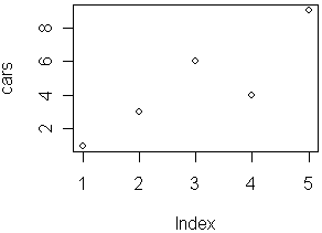
First, we'll produce a very simple graph using the values in the car vector:

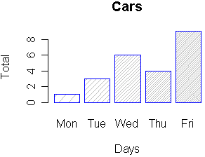
# Define the cars vector with 5 values
cars <- c(1, 3, 6, 4, 9)

# Graph the cars vector with all defaults
plot(cars)
Five data points on a graph

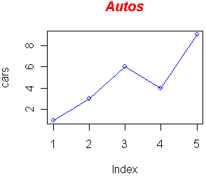
Let's add a title, a line to connect the points, and some color:

# Define the cars vector with 5 values
cars <- c(1, 3, 6, 4, 9)

# Graph cars using blue points overlayed by a line 
plot(cars, type="o", col="blue")

# Create a title with a red, bold/italic font
title(main="Autos", col.main="red", font.main=4)
Line graph

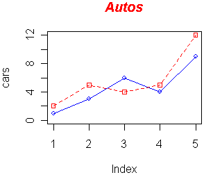
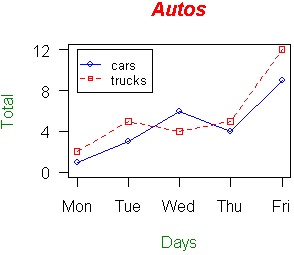
Now let's add a red line for trucks and specify the y-axis range directly so it will be large enough to fit the truck data:

# Define 2 vectors
cars <- c(1, 3, 6, 4, 9)
trucks <- c(2, 5, 4, 5, 12)

# Graph cars using a y axis that ranges from 0 to 12
plot(cars, type="o", col="blue", ylim=c(0,12))

# Graph trucks with red dashed line and square points
lines(trucks, type="o", pch=22, lty=2, col="red")

# Create a title with a red, bold/italic font
title(main="Autos", col.main="red", font.main=4)
Line graph with two lines

Next, let's change the axes labels to match our data and add a legend. We'll also compute the y-axis values using the max function so any changes to our data will be automatically reflected in our graph.

# Define 2 vectors
cars <- c(1, 3, 6, 4, 9)
trucks <- c(2, 5, 4, 5, 12)

# Calculate range from 0 to max value of cars and trucks
g_range <- range(0, cars, trucks)

# Graph autos using y axis that ranges from 0 to max 
# value in cars or trucks vector.  Turn off axes and 
# annotations (axis labels) so we can specify them ourself
plot(cars, type="o", col="blue", ylim=g_range, 
   axes=FALSE, ann=FALSE)

# Make x axis using Mon-Fri labels
axis(1, at=1:5, lab=c("Mon","Tue","Wed","Thu","Fri"))

# Make y axis with horizontal labels that display ticks at 
# every 4 marks. 4*0:g_range[2] is equivalent to c(0,4,8,12).
axis(2, las=1, at=4*0:g_range[2])

# Create box around plot
box()

# Graph trucks with red dashed line and square points
lines(trucks, type="o", pch=22, lty=2, col="red")

# Create a title with a red, bold/italic font
title(main="Autos", col.main="red", font.main=4)

# Label the x and y axes with dark green text
title(xlab="Days", col.lab=rgb(0,0.5,0))
title(ylab="Total", col.lab=rgb(0,0.5,0))

# Create a legend at (1, g_range[2]) that is slightly smaller 
# (cex) and uses the same line colors and points used by 
# the actual plots 
legend(1, g_range[2], c("cars","trucks"), cex=0.8, 
   col=c("blue","red"), pch=21:22, lty=1:2);
Graph with legend

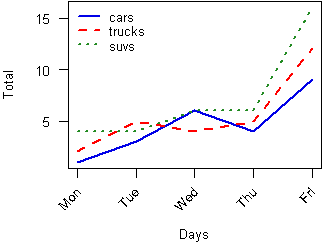
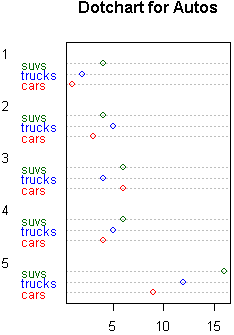
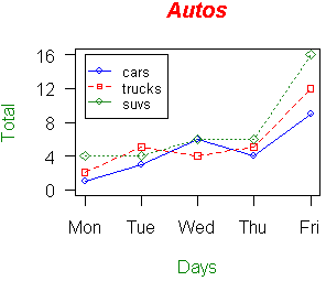
Now let's read the graph data directly from a tab-delimited file. The file contains an additional set of values for SUVs. We'll save the file in the C:/R directory (you'll use a different path if not using Windows).

autos.dat

cars	trucks	suvs
1	2	4
3	5	4
6	4	6
4	5	6
9	12	16

We'll also use a vector for storing the colors to be used in our graph so if we want to change the colors later on, there's only one place in the file that needs to be modified. Finally, we'll send the figure directly to a PNG file.

# Read car and truck values from tab-delimited autos.dat
autos_data <- read.table("C:/R/autos.dat", header=T, sep="\t") 

# Compute the largest y value used in the data (or we could
# just use range again)
max_y <- max(autos_data)

# Define colors to be used for cars, trucks, suvs
plot_colors <- c("blue","red","forestgreen")

# Start PNG device driver to save output to figure.png
png(filename="C:/R/figure.png", height=295, width=300, 
bg="white")
# Graph autos using y axis that ranges from 0 to max_y. # Turn off axes and annotations (axis labels) so we can # specify them ourself plot(autos_data$cars, type="o", col=plot_colors[1], ylim=c(0,max_y), axes=FALSE, ann=FALSE) # Make x axis using Mon-Fri labels axis(1, at=1:5, lab=c("Mon", "Tue", "Wed", "Thu", "Fri")) # Make y axis with horizontal labels that display ticks at # every 4 marks. 4*0:max_y is equivalent to c(0,4,8,12). axis(2, las=1, at=4*0:max_y) # Create box around plot box() # Graph trucks with red dashed line and square points lines(autos_data$trucks, type="o", pch=22, lty=2, col=plot_colors[2]) # Graph suvs with green dotted line and diamond points lines(autos_data$suvs, type="o", pch=23, lty=3, col=plot_colors[3]) # Create a title with a red, bold/italic font title(main="Autos", col.main="red", font.main=4) # Label the x and y axes with dark green text title(xlab= "Days", col.lab=rgb(0,0.5,0)) title(ylab= "Total", col.lab=rgb(0,0.5,0)) # Create a legend at (1, max_y) that is slightly smaller # (cex) and uses the same line colors and points used by # the actual plots legend(1, max_y, names(autos_data), cex=0.8, col=plot_colors, pch=21:23, lty=1:3); # Turn off device driver (to flush output to png) dev.off()
Graph plotting data from autos.dat

In this next example, we'll save the file to a PDF and chop off extra white space around the graph; this is useful when wanting to use figures in LaTeX. We'll also increase the line widths, shrink the axis font size, and tilt the x-axis labels by 45 degrees.

# Read car and truck values from tab-delimited autos.dat
autos_data <- read.table("C:/R/autos.dat", header=T, sep="\t")
			
# Define colors to be used for cars, trucks, suvs
plot_colors <- c(rgb(r=0.0,g=0.0,b=0.9), "red", "forestgreen")

# Start PDF device driver to save output to figure.pdf
pdf(file="C:/R/figure.pdf", height=3.5, width=5)
			
# Trim off excess margin space (bottom, left, top, right)
par(mar=c(4.2, 3.8, 0.2, 0.2))
			
# Graph autos using a y axis that uses the full range of value
# in autos_data. Label axes with smaller font and use larger 
# line widths.
plot(autos_data$cars, type="l", col=plot_colors[1], 
   ylim=range(autos_data), axes=F, ann=T, xlab="Days",
   ylab="Total", cex.lab=0.8, lwd=2)

# Make x axis tick marks without labels
axis(1, lab=F)

# Plot x axis labels at default tick marks with labels at 
# 45 degree angle
text(axTicks(1), par("usr")[3] - 2, srt=45, adj=1,
          labels=c("Mon", "Tue", "Wed", "Thu", "Fri"),
          xpd=T, cex=0.8)

# Plot y axis with smaller horizontal labels 
axis(2, las=1, cex.axis=0.8)

# Create box around plot
box()

# Graph trucks with thicker red dashed line
lines(autos_data$trucks, type="l", lty=2, lwd=2, 
  col=plot_colors[2])

# Graph suvs with thicker green dotted line
lines(autos_data$suvs, type="l", lty=3, lwd=2, 
  col=plot_colors[3])

# Create a legend in the top-left corner that is slightly  
# smaller and has no border
legend("topleft", names(autos_data), cex=0.8, col=plot_colors, 
   lty=1:3, lwd=2, bty="n");
  
# Turn off device driver (to flush output to PDF)
dev.off()

# Restore default margins
par(mar=c(5, 4, 4, 2) + 0.1)
Cars line is solid blue, trucks is dashed red, suvs is dotted green

Bar Charts

Let's start with a simple bar chart graphing the cars vector:

# Define the cars vector with 5 values
cars <- c(1, 3, 6, 4, 9)

# Graph cars
barplot(cars)
Bar chart with gray bars

Let's now read the auto data from the autos.dat data file, add labels, blue borders around the bars, and density lines:

# Read values from tab-delimited autos.dat 
autos_data <- read.table("C:/R/autos.dat", header=T, sep="\t")
   
# Graph cars with specified labels for axes.  Use blue 
# borders and diagnal lines in bars.
barplot(autos_data$cars, main="Cars", xlab="Days",  
   ylab="Total", names.arg=c("Mon","Tue","Wed","Thu","Fri"), 
   border="blue", density=c(10,20,30,40,50))
Bar chart with lined bars

Now let's graph the total number of autos per day using some color and show a legend:

# Read values from tab-delimited autos.dat 
autos_data <- read.table("C:/R/autos.dat", header=T, sep="\t")
   
# Graph autos with adjacent bars using rainbow colors
barplot(as.matrix(autos_data), main="Autos", ylab= "Total",
   beside=TRUE, col=rainbow(5))

# Place the legend at the top-left corner with no frame  
# using rainbow colors
legend("topleft", c("Mon","Tue","Wed","Thu","Fri"), cex=0.6, 
   bty="n", fill=rainbow(5));
Bar chart with colorful bars

Let's graph the total number of autos per day using a stacked bar chart and place the legend outside of the plot area:

# Read values from tab-delimited autos.dat
autos_data <- read.table("C:/R/autos.dat", header=T, sep="\t") 

# Expand right side of clipping rect to make room for the legend
par(xpd=T, mar=par()$mar+c(0,0,0,4))

# Graph autos (transposing the matrix) using heat colors,  
# put 10% of the space between each bar, and make labels  
# smaller with horizontal y-axis labels
barplot(t(autos_data), main="Autos", ylab="Total", 
   col=heat.colors(3), space=0.1, cex.axis=0.8, las=1,
   names.arg=c("Mon","Tue","Wed","Thu","Fri"), cex=0.8) 
   
# Place the legend at (6,30) using heat colors
legend(6, 30, names(autos_data), cex=0.8, fill=heat.colors(3));
   
# Restore default clipping rect
par(mar=c(5, 4, 4, 2) + 0.1)
Bar chart with stacked bars

Histograms

Let's start with a simple histogram graphing the distribution of the suvs vector:

# Define the suvs vector with 5 values
suvs <- c(4,4,6,6,16)

# Create a histogram for suvs
hist(suvs)
Histogram of SUVs with white bars

Let's now read the auto data from the autos.dat data file and plot a histogram of the combined car, truck, and suv data in color.

# Read values from tab-delimited autos.dat
autos_data <- read.table("C:/R/autos.dat", header=T, sep="\t")

# Concatenate the three vectors
autos <- c(autos_data$cars, autos_data$trucks, 
   autos_data$suvs)

# Create a histogram for autos in light blue with the y axis
# ranging from 0-10
hist(autos, col="lightblue", ylim=c(0,10))
Histogram of autos with blue bars

Now change the breaks so none of the values are grouped together and flip the y-axis labels horizontally.

# Read values from tab-delimited autos.dat
autos_data <- read.table("C:/R/autos.dat", header=T, sep="\t")

# Concatenate the three vectors
autos <- c(autos_data$cars, autos_data$trucks, 
   autos_data$suvs)

# Compute the largest y value used in the autos
max_num <- max(autos)

# Create a histogram for autos with fire colors, set breaks
# so each number is in its own group, make x axis range from
# 0-max_num, disable right-closing of cell intervals, set
# heading, and make y-axis labels horizontal
hist(autos, col=heat.colors(max_num), breaks=max_num, 
   xlim=c(0,max_num), right=F, main="Autos Histogram", las=1)
Histogram of autos with different groupings

Now let's create uneven breaks and graph the probability density.

# Read values from tab-delimited autos.dat
autos_data <- read.table("C:/R/autos.dat", header=T, sep="\t")

# Concatenate the three vectors
autos <- c(autos_data$cars, autos_data$trucks, 
   autos_data$suvs)

# Compute the largest y value used in the autos
max_num <- max(autos)

# Create uneven breaks
brk <- c(0,3,4,5,6,10,16)

# Create a histogram for autos with fire colors, set uneven
# breaks, make x axis range from 0-max_num, disable right-
# closing of cell intervals, set heading, make y-axis labels 
# horizontal, make axis labels smaller, make areas of each
# column proportional to the count
hist(autos, col=heat.colors(length(brk)), breaks=brk, 
   xlim=c(0,max_num), right=F, main="Probability Density", 
   las=1, cex.axis=0.8, freq=F)


Histogram of autos with probability density

In this example we'll plot the distribution of 1000 random values that have the log-normal distribution.

# Get a random log-normal distribution
r <- rlnorm(1000)

hist(r)
Histogram showing log-normal distribution

Since log-normal distributions normally look better with log-log axes, let's use the plot function with points to show the distribution.

# Get a random log-normal distribution
r <- rlnorm(1000)

# Get the distribution without plotting it using tighter breaks
h <- hist(r, plot=F, breaks=c(seq(0,max(r)+1, .1)))

# Plot the distribution using log scale on both axes, and use
# blue points
plot(h$counts, log="xy", pch=20, col="blue",
	main="Log-normal distribution",
	xlab="Value", ylab="Frequency")

Histogram showing log-normal distribution with log-log axes

Pie Charts

Let's start with a simple pie chart graphing the cars vector:

# Define cars vector with 5 values
cars <- c(1, 3, 6, 4, 9)

# Create a pie chart for cars
pie(cars)
Pie chart of cars

Now let's add a heading, change the colors, and define our own labels:

# Define cars vector with 5 values
cars <- c(1, 3, 6, 4, 9)

# Create a pie chart with defined heading and
# custom colors and labels
pie(cars, main="Cars", col=rainbow(length(cars)),
   labels=c("Mon","Tue","Wed","Thu","Fri"))
Pie chart with rainbow colors

Now let's change the colors, label using percentages, and create a legend:

# Define cars vector with 5 values
cars <- c(1, 3, 6, 4, 9)

# Define some colors ideal for black & white print
colors <- c("white","grey70","grey90","grey50","black")

# Calculate the percentage for each day, rounded to one 
# decimal place
car_labels <- round(cars/sum(cars) * 100, 1)

# Concatenate a '%' char after each value
car_labels <- paste(car_labels, "%", sep="")

# Create a pie chart with defined heading and custom colors
# and labels
pie(cars, main="Cars", col=colors, labels=car_labels,
   cex=0.8)

# Create a legend at the right   
legend(1.5, 0.5, c("Mon","Tue","Wed","Thu","Fri"), cex=0.8, 
   fill=colors)
Pie chart of cars with shades of gray and a legend

Dotcharts

Let's start with a simple dotchart graphing the autos data:

# Read values from tab-delimited autos.dat
autos_data <- read.table("C:/R/autos.dat", header=T, sep="\t")

# Create a dotchart for autos
dotchart(t(autos_data))
Dotchart of autos.dat

Let's make the dotchart a little more colorful:

# Read values from tab-delimited autos.dat
autos_data <- read.table("C:/R/autos.dat", header=T, sep="\t")

# Create a colored dotchart for autos with smaller labels
dotchart(t(autos_data), color=c("red","blue","darkgreen"),
   main="Dotchart for Autos", cex=0.8)
Dotchart of autos.dat with color

Misc

This example shows all 25 symbols that you can use to produce points in your graphs:

# Make an empty chart
plot(1, 1, xlim=c(1,5.5), ylim=c(0,7), type="n", ann=FALSE)

# Plot digits 0-4 with increasing size and color
text(1:5, rep(6,5), labels=c(0:4), cex=1:5, col=1:5)

# Plot symbols 0-4 with increasing size and color
points(1:5, rep(5,5), cex=1:5, col=1:5, pch=0:4)
text((1:5)+0.4, rep(5,5), cex=0.6, (0:4))

# Plot symbols 5-9 with labels
points(1:5, rep(4,5), cex=2, pch=(5:9))
text((1:5)+0.4, rep(4,5), cex=0.6, (5:9))

# Plot symbols 10-14 with labels
points(1:5, rep(3,5), cex=2, pch=(10:14))
text((1:5)+0.4, rep(3,5), cex=0.6, (10:14))

# Plot symbols 15-19 with labels
points(1:5, rep(2,5), cex=2, pch=(15:19))
text((1:5)+0.4, rep(2,5), cex=0.6, (15:19))

# Plot symbols 20-25 with labels
points((1:6)*0.8+0.2, rep(1,6), cex=2, pch=(20:25))
text((1:6)*0.8+0.5, rep(1,6), cex=0.6, (20:25))
Graph of 25 R symbols